I don¡¯t think the old icons for these apps from MacOS 15 were particularly good?¡ª?Apple has mostly lost its ¡°icons look cool¡± game. But the new ones in MacOS 26 Tahoe are objectively terrible. The only one of this bunch that¡¯s maybe sort of OK is Wireless Diagnostics. They all look like placeholder icons made by a developer who would be the first to admit that they¡¯re not an artist. Disk Utility, which is an important app, doesn¡¯t even look like it involves a disk.
These new icons all use the same ¡°wrench¡± motif, which is a lazy, limiting concept to start with. Tahoe, at the system level, enforces a squircle shape on all application icons. Apps that haven¡¯t been updated with Tahoe-compliant everything-fits-in-a-squircle icons are put in ¡°squircle jail¡±?¡ª?their non-Tahoe-compliant icons are shrunk and placed atop a drab gray Tahoe squircle background, to force them into squircle compliance. But these Apple utility apps have an entire sub-motif?¡ª?inside their base squircle shape is a large wrench fitted against a bolt. Only inside the bolt?¡ª?which is inside the wrench¡¯s jaws, which wrench is inside the squircle?¡ª?goes the part of the icon that identifies the app itself. So maybe like 10 percent of the area of the icon is the area where the app can show something that identifies its purpose.
So the entire concept for these icons sucks. But the conceptual execution sucks too. The wrench is incredibly stupid-looking. Whoever drew it has obviously never used an open-end wrench because the jaws on the wrench head are way too thin. They¡¯d break off under any significant torque. Just look at a real-life wrench, or just look at the wrench heads in the older MacOS icons (or Apple¡¯s ? emoji, for that matter).
Individually the icons mostly suck too:
Disk Utility?¡ª?a very important app?¡ª?has an icon that¡¯s just an Apple logo (inside the bolt that¡¯s inside the wrench that¡¯s inside the squircle). Not a hard disk, not an external drive, not an SD card. Just an Apple logo. If I just showed you this icon without telling you which app it represented, how in the world could you guess what it is? Even if you know the ¡°Apple utility app icon¡± motif of the big dumb wrench and bolt, the best you could guess is ¡°a utility app for something Apple-related¡± which, for an Apple computer, could be anything.
Expansion Slot Utility?¡ª?This app only runs on Mac Pros because Mac Pros are the only Macs with expansion slots. So the old icon naturally shows a Mac Pro. The new icon shows ... three rectangular empty sockets?
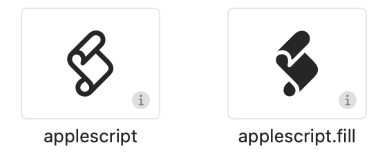
AppleScript Utility?¡ª?A fine concept for this icon (within the confines of the terrible wrench-and-bolt utility icon concept). Everyone who knows AppleScript knows the scroll that represents AppleScript scripts. So just put the iconic AppleScript scroll in the bolt in the wrench in the squircle. But here, the placement of the scroll is botched?¡ª?it¡¯s rotated a few degrees counterclockwise. It makes the scroll look like it¡¯s falling over. Here¡¯s how the scroll is canonically oriented, via the glyphs in SF Symbols:
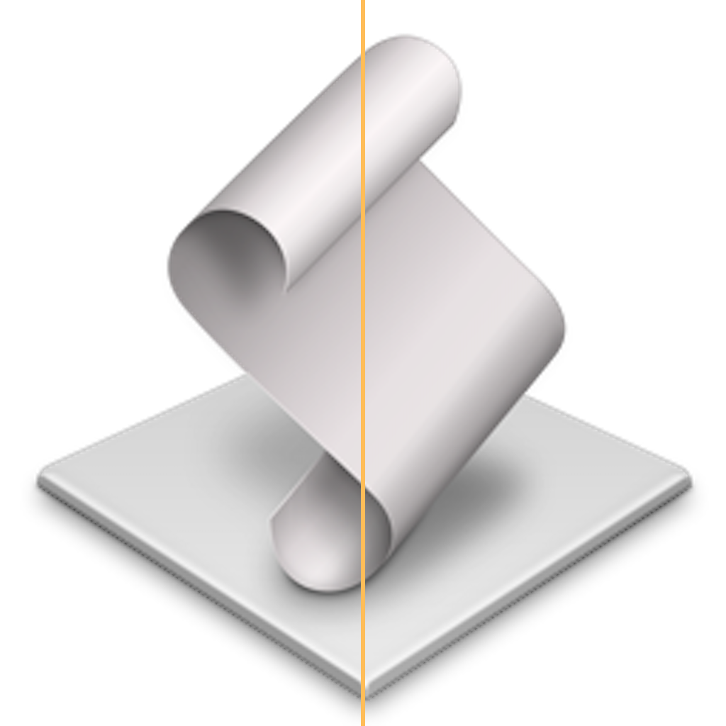
and via the default icon for a script application (with a line added showing the center):
But here¡¯s a close-up of the Tahoe AppleScript Utility icon, with a center line added:
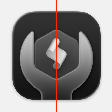
It¡¯s wrong.
These are the not the work of carpenters who care about the backs of the cabinets they¡¯re building. These icons are so bad, they look like the work of untrained ¡°How hard can it be?¡± dilettante carpenters who only last a few days on the job before sawing off one of their own fingers. The whole collection looks like the work from someone with no artistic ability nor an eye for detail. From Apple, of all companies.
Is it a big deal in the grand scheme of things that the icons for these seldom-used utility apps have gone to shit? No. But consider the proverbial canary in a coal mine. The problem isn¡¯t that one little bird has died. The problem is that the bird might be dead because the whole mine is filling with deadly carbon monoxide or highly flammable methane gas. The icons in /Applications/Utilities/ in MacOS 26 Tahoe represent a folder full of dead canaries.
]]>MSNBC, the progressive cable network owned by NBCUniversal, is rebranding to MS NOW, an acronym that stands for My Source for News, Opinion and the World.
The rebrand is part of a wider effort by NBCU to create a distinction between the cable networks it plans to spin out and the remaining NBCU parent company. As part of the rebrand, select cable networks that will be spun out into Versant, including CNBC, Golf Channel, GolfNow, MSNBC and SportsEngine, will all drop the iconic peacock logo that has for decades served as NBCU¡¯s logo.
There¡¯s a lot to unpack here. First, ¡°Versant¡± itself is a pretty bad name (feels so vague?¡ª?seems like the name of a fake company in a movie or TV show) so it¡¯s no surprise that the same nitwits are botching Versant¡¯s rebranded properties. But given that NBCUniversal is apparently forcing MSNBC to take the ¡°NBC¡± out of its name, ¡°MSNOW¡± isn¡¯t a bad new name. But it¡¯s not a good new name either. And they¡¯re apparently using a space: ¡°MS NOW¡±, yet also seem confused (or haven¡¯t even decided yet) whether it¡¯s supposed to be pronounced letter-by-letter (em ess en oh dubya) or as two letters and a word (em ess now). Saying the ¡°NOW¡± as the word now makes sense for a 24/7 channel, but if it¡¯s a word, the whole name should be styled ¡°MS Now¡±. (Fox News styles their name as ¡°FOX News¡± in some places, but never pretends the f-o-x is an acronym.)
The ¡°My Source News Opinion World¡± backronym is so dumb it boggles the mind. I genuinely wonder if someone had ChatGPT do that. You can have a series of letters as a name?¡ª?especially as a TV channel?¡ª?without those letters really standing for anything. CNN is technically an acronym for ¡°Cable News Network¡± but they¡¯ve effectively just been ¡°CNN¡± for decades now. The name ¡°MSNBC¡± came from the fact that, at launch in the 1990s, it debuted as a collaboration between Microsoft¡¯s MSN and NBC News. But Microsoft hasn¡¯t been involved with the cable channel for 20 years?¡ª?the ¡°MS¡± in ¡°MSNBC¡± hasn¡¯t stood for anything since 2005. (In fact, MSN itself is another good example. It originally stood for ¡°Microsoft Network¡±, even though Microsoft has never styled their name with a camel-cased S.1 But it¡¯s really just ¡°MSN¡± now.)2
Tom Gara, writing on Threads:
The only real fuck up with the MSNBC rebrand is that they made up a dumb sounding fake acronym. It¡¯s completely unnecessary! Just say ¡°we¡¯re changing our name to MS NOW to reflect the urgency of the moment.¡± Nobody has ever thought about what the old acronym stood for and nobody needed a new fake one.
There is another fuck up, though: the logo is atrocious. What is that flag? It looks like the Austrian flag (??), not America¡¯s. But are we sure it even is a flag? Maybe it¡¯s a paper receipt and the red stripes are those marks when it¡¯s time to replace the roll? Jonathan Hoefler, on Threads:
My personal benchmark for a logo is that it shouldn¡¯t look like a pension fund.
The oddest part about the whole situation is that CNBC is being spun out into Versant, too, but while they¡¯re losing the NBC peacock logo, they¡¯re just keeping their name, unchanged. From CNBC¡¯s own coverage of MSNBC¡¯s rebranding:
While MSNBC and NBC News will have duplications in coverage, CNBC¡¯s news organization is already separate enough from NBC News that executives decided it didn¡¯t need a name change. Also, technically, the ¡°NBC¡± in ¡°CNBC¡± never stemmed from National Broadcasting Co. Rather, CNBC stands for ¡°Consumer News and Business Channel.¡±
Lastly, shoutout to M.G. Siegler for coining the term peacockblocked to describe MSNBC¡¯s branding plight.
-
Historical pedantry: from 1975¨C1979, Microsoft spelled its name ¡°Micro-Soft¡±, with, yes, an uppercase S. But that¡¯s not camel-case, and that hyphenated spelling is as much a footnote to Microsoft¡¯s brand history as the woodcut Isaac-Newton-under-a-tree logo is to Apple. Microsoft¡¯s logo from that era was very disco-¡¯70s and kind of cool?¡ª?but while ¡°Micro¡± and ¡°Soft¡± were broken across two lines, there¡¯s no hyphen in the logotype. ↩︎?
-
If I¡¯d been in the room, my spitball idea for a new name would have been MNC. Take out every other letter to break both the NBC and Microsoft connotations, but leave behind an acronym that looks and sounds like a tighter, more efficient version of MSNBC. If they really insisted that the acronym stand for something, it could be Modern (or Major?) News Channel. ↩︎
If you have more than one iPhone that is both signed in to your Apple Account and nearby, you can choose the one that your Mac uses for mirroring and iPhone notifications:
Choose Apple menu ? > System Settings, then click Desktop & Dock in the sidebar.
Choose your iPhone from the iPhone pop-up menu on the right. This menu appears just below the ¡°Use iPhone widgets¡± setting. It appears only when your Mac detects more than one nearby iPhone that can be used for mirroring.
That pop-up menu is about halfway down the screen in Desktop & Dock, in the ¡°Widgets¡± section.1 I suspected this was possible, but I had to search the web (via Kagi, the best search engine in the world, of course) to find the answer. I never would have thought to look in System Settings ¡ú Desktop & Dock, let alone, even if I happened to look in that panel, all the way down under ¡°Widgets¡±.
Places where I did look:
- On the Mac, in the iPhone Mirroring app¡¯s own Settings window. Nope.
- On the iPhone, in Settings ¡ú General ¡ú Airplay & Continuity. This is where you can control which Mac or Macs your iPhone is available from with iPhone Mirroring (e.g. you can go here to revoke access from a certain Mac), but it doesn¡¯t help you change which iPhone, among multiple, that any particular Mac connects to.
To Apple¡¯s credit, searching for ¡°mirroring¡± in MacOS System Settings does lead you to the correct setting, but because it¡¯s under ¡°Widget settings¡±, I suspect some people who search for ¡°mirroring¡± here will see that in the results list and not even bother clicking it, because ¡°Widget settings¡± at first doesn¡¯t sound like where you should go to choose between multiple phones for iPhone Mirroring. (It kind of makes sense, when you realize that the same iPhone that provides widgets to your Mac is the one available for iPhone Mirroring to connect to.)
To Apple¡¯s discredit, Siri is no help, despite Apple Intelligence¡¯s supposed ability to harness ¡°product knowledge¡± from LLM training on Apple¡¯s own support documents. After asking Siri, ¡°How do I use multiple iPhones with iPhone mirroring?¡± on either a Mac or iPhone, I get a brief answer that says ¡°You can set up more than one iPhone to use iPhone Mirroring with your Mac, but you can only connect to one iPhone at a time¡±, with a link to the iPhone User Guide that opens in the Tips app. That page in the iPhone User Guide, however?¡ª?also available on the web as ¡°Control Your iPhone From Your Mac¡±?¡ª?doesn¡¯t contain any mention of using more than one iPhone with iPhone Mirroring. So this Apple Support document on iPhone Mirroring does explain it (that¡¯s the one I linked to at the top of this post), but this one does not. No wonder Apple Intelligence¡¯s ¡°product knowledge¡±, trained on these documents, is somewhat confused.
But it gets worse. I gave Siri a second chance on my Mac, asking the same question, something along the lines of ¡°How do I use multiple iPhones with iPhone mirroring?¡± (I can¡¯t be sure exactly which words I used because Siri doesn¡¯t show a chat transcript2), and the second time, it responded thus:
To use multiple iPhones with iPhone Mirroring:
- Open the iPhone Mirroring app on your Mac.
- Click the ¡°Connect¡± button.
- Enter your iPhone passcode and choose how to authenticate.
- Select the iPhone you want to use from the list of available iPhones.
This answer certainly describes one possible way that using multiple iPhones with iPhone Mirroring should work, but as an answer for how it actually does work, it¡¯s abject nonsense. There is no ¡°list of available iPhones¡± in the iPhone Mirroring app. If there were such a list to choose from, I¡¯d never have had a question about this whole fucking thing in the first place.
-
The first time I looked in the Desktop & Dock panel in System Settings, there was no ¡°iPhone¡± pop-up menu visible, despite the fact that both of my active iPhones were on my desk, right next to my MacBook Pro. But I remembered that in the last few days, I¡¯d been having problems with Continuity¡¯s Universal Clipboard feature too. In the past, when Universal Clipboard has gone on the fritz, I¡¯ve solved the problem by toggling Bluetooth off and back on. I toggled Bluetooth on my Mac and boom, the ¡°iPhone¡± menu appeared in the Desktop & Dock panel in System Settings, with the pop-up menu correctly listing both of my active iPhones. Universal Clipboard started working correctly again too. I bet the next version of Bluetooth is actually going to be reliable. ↩︎?
-
From Wayne Ma¡¯s blockbuster report back in April at The Information, ¡°How Apple Fumbled Siri¡¯s AI Makeover¡±:
Giannandrea often has described to employees his belief that machine learning can lead to incremental improvements in products, eventually adding up to major gains, a concept he refers to as hill climbing. He also has expressed a dim view of chatbots in the past, telling Apple employees before and immediately after the release of ChatGPT that he didn¡¯t believe they added much value for users.
ChatGPT reported 700 million weekly active users this month, up from 500 million in March, and up 4¡Á from last year. ↩︎
For his first movie job?¡ª?he would work on more than 300 campaigns during his career?¡ª?United Artists executive David Chasman hired him to design the poster for West Side Story (1961), then asked him to come up with the letterhead for a publicity release tied to the first Bond film, Dr. No. (Chasman had designed the poster for the 1962 movie.)
¡°He said, ¡®I need a little decorative thing on top,¡¯¡± Caroff recalled in 2021. ¡°I knew [Bond¡¯s] designation was 007, and when I wrote the stem of the seven, I thought, ¡®That looks like the handle of a gun to me.¡¯ It was very spontaneous, no effort, it was an instant piece of creativity.¡±
Inspired by Ian Fleming¡¯s favorite gun, a Walther PPK, Caroff attached a barrel and trigger to the 007 and for his work received $300, the going rate for such an assignment, he said. Even though the logo, though altered in subtle ways, has been featured on every Bond film and on millions of pieces of merchandise, he received no credit, no residuals, no royalties.
The logo did, however, bring him ¡°a lot of business,¡± he said. ¡°It was like a little publicity piece for me.¡±
It¡¯s rare for a logomark to have such staying power. Just a perfect logo. Kind of wild that it was created, initially, only as letterhead for stationery. Perusing vintage movie posters, it seems like EON didn¡¯t really lean into using the logo consistently until On Her Majesty¡¯s Secret Service (1969)?¡ª?the sixth film, and the first without Sean Connery. EON had used the mark prior to that (including at least one excellent poster for Dr. No), but it didn¡¯t appear on most of the posters for Connery¡¯s initial run in the role: From Russia With Love, Goldfinger, Thunderball, and You Only Live Twice (variations A and B). Amongst those, the logo only appears on the Goldfinger poster. They used to make multiple posters for every movie back then, so there might exist examples for all of them with the logo. But I think until On Her Majesty¡¯s Secret Service, EON leaned on Connery¡¯s face as the symbol of the franchise. From that point forward, though, Caroff¡¯s 007-cum-gun logo was the symbol of the franchise.1 I can¡¯t seem to find an official movie poster after OHMSS that doesn¡¯t feature it.
I will quibble with one detail from The Hollywood Reporter description above: the gun in Caroff¡¯s original 007 mark clearly looked like a Luger, a rather distinctive German pistol with a long skinny barrel, not the more compact Walther PPK that Bond actually carried. Variations of the Luger-esque logo appear on the posters for all seven of the movies starring Roger Moore. EON updated the logomark to resemble a Walther PPK for The Living Daylights in 1987, the first (and better) of two Bond movies starring Timothy Dalton. As a kid it always bothered me?¡ª?ever so slightly?¡ª?that the logo resembled a gun that James Bond never actually used, but until today, researching this post, I never noticed that they addressed that in 1987. That said, I think the Luger-esque mark was a bit cooler. As a kid, that was my assumption: that ¡°they¡± made it look like a Luger, not the sort of pistol Bond actually carried, because it looked cooler that way. I accepted that.
Caroff had a remarkably accomplished career. He created iconic posters for dozens of terrific films across a slew of genres. The fact that he created the 007 logo but only earned $300 from it is more like a curious footnote than anything.
From Jer¨¦ Longman¡¯s excellent obituary for The New York Times (gift link), after observing that Caroff died just one day short of his 104th birthday:
Mr. Caroff¡¯s designs were familiar, but his name was not. He did not sign much of his work and largely avoided self-promotion. He was not included among the more than 60 celebrated designers, among them like Saul Bass, Leo Lionni and Paul Rand, in the 2017 book The Moderns: Midcentury American Graphic Design, written by Steven Heller and Greg D¡¯Onofrio.
¡°That he was unknown is shocking,¡± Mr. Heller, co-chairman emeritus of the Master of Fine Arts Design program at the School of Visual Arts in Manhattan, said in a recent interview.
Still, Mr. Caroff¡¯s abundant output became widely recognizable for an interpretive style that could be bold, elegant, theatrical, whimsical, sensual and deceptively simple in promoting a book or movie and conveying its essence with a single image.
No better example of that reduced-to-its-essence genius than his 007 logo:
¡°I knew that 007 meant license to kill; that, I think, at an unconscious level, was the reason I knew the gun had to be in the logo,¡± Mr. Caroff said in a 2022 documentary, By Design: The Joe Caroff Story.
Mark Cerulli, who directed the documentary, said in an interview that the logo was a ¡°marvel of simplicity that telegraphs everything you would want to know about 007.¡±
By Design is streaming on HBO Max. I¡¯ve added it to the top of my to-watch list.
-
You will not catch me making any jokes about the fact that ¡°007 cum gun¡± could serve as a three-word plot synopsis for many of the films in the Connery/Moore era. ↩︎